The Oasis Effect: When Brands Evolve Beyond Their Visual DNA
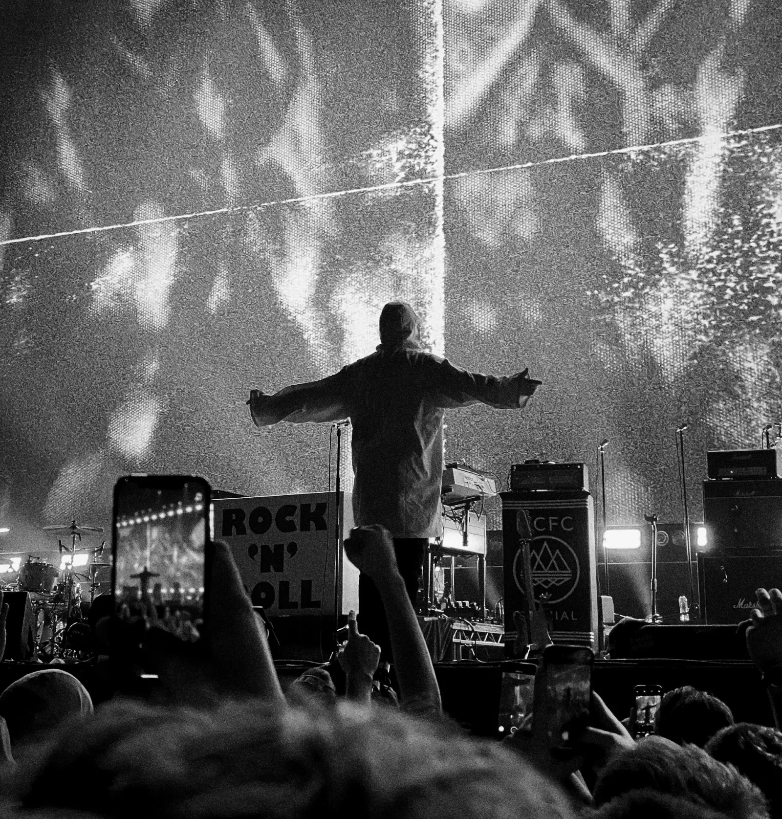
This isn't just nostalgia – it's a masterclass in understanding your brand's visual DNA. That brutal, uncompromising logo designed by Brian Cannon in 1993 wasn't just decoration; it was Oasis distilled into pure visual form. Bold, direct, slightly aggressive, and utterly confident.
When Visual DNA Actually Works
Some brand-to-aesthetic matches are so logical they feel inevitable. Luxury brands live in minimalist white space because emptiness suggests exclusivity – if you have to ask the price, you can't afford it. Tech startups embrace clean lines and sans-serif fonts because they're selling the future, not the past.
Metal bands really do go dark and aggressive because their music sounds dark and aggressive. Craft breweries genuinely look rustic and handcrafted because their beer tastes rustic and handcrafted. Children's brands are bright and playful because children are bright and playful.
These aren't creative clichés – they're visual truth-telling.
The Lazy Middle Ground
But then you hit the boring middle: law firms that default to navy blue and serif fonts because "trustworthy," gyms that go red and black because "intense," accountants that choose calculator iconography because… well, because that's what accountants do, apparently.
This is where visual DNA becomes visual laziness. When funeral homes all look identically sombre, or financial services all default to "corporate blue," they're not expressing their brand – they're hiding behind their industry's uniform.
The Fascinating Grey Areas
Period-specific businesses create the most interesting design challenges. An 80s nostalgia brand probably should look like 1985 threw up on it – that's the entire point. A vintage clothing store benefits from genuinely vintage typography and layouts.
But what about food and restaurants? A Michelin-starred establishment earns its minimal, expensive-feeling website. A traditional pub can justify warm browns and cosy imagery. But when every pizza place looks identically "Italian" with red, white, and script fonts, authenticity becomes pastiche.
The Evolution Question
Oasis tried evolution. After their initial success, they experimented with different logos, including Noel's own sketched design for "Standing on the Shoulders of Giants." It worked fine, but it wasn't them. When reunion time came, they instinctively returned to what made them famous.
Apple faced similar choices throughout their evolution – the rainbow logo of the 80s, the monochrome apple of the 90s, the current sleek version. Each reflected where they were, but the core symbol remained consistent.
The lesson? Evolution should enhance your DNA, not replace it.
When Industries Get It Wrong
Car dealerships don't need to look like Used Car Lot Stereotype #47. Dentists can be modern and approachable rather than clinical and sterile. Estate agents might try actual personality instead of generic "property professional" templating.
The most memorable brands are often the ones that break their industry's visual rules whilst staying true to themselves.
The Fresh Start Test
Here's the key question: if you covered your logo and industry identifiers, would someone still understand what you're about from your design alone?
Patagonia feels outdoorsy without mountains everywhere. Innocent feels playful without cartoon fruit. Brew Dog feels rebellious without trying too hard to look punk.
When Oasis returned to their 1993 logo, they passed this test perfectly. That stark, confident rectangle immediately communicates everything you need to know about their attitude, even without the band name.
Building Visual Honesty
Your website should feel like walking into your actual business. If your physical space is warm and welcoming, your digital presence should be too. If you're all about cutting-edge innovation, show it. If you're proudly traditional, own it.
But here's the crucial bit: it should feel authentic to you, not just appropriate for your sector.
The Oasis reunion reminded us that sometimes the best creative decision is the obvious one. When your original visual DNA perfectly captures who you are, evolution might just mean coming home.
At Rocking Tech, we help creative businesses find their authentic digital voice – not what their industry expects, but what genuinely represents who they are. From bold statements to subtle sophistication, we build websites that feel like the real you. Let's create something uniquely yours.
The next decision is the expensive one. Let’s make sure it’s the right one.
Prefer to talk? Book a discovery call or email hello@rockingtech.co.uk