Liquid Glass Web Design in 2025
From frosted icons to Liquid Glass
Interface design swings like a pendulum. The 2000s gave us leather textures and metal buttons. iOS 7 stripped everything back to flat colour. Google's Material Design reintroduced subtle shadows and motion. Around 2020, glassmorphism brought frosted panels to macOS Big Sur and countless Dribbble shots. Apple's Liquid Glass is simply the latest swing toward glossy, textured, maximalist interfaces. It will not be the last.
What Liquid Glass web design can really do
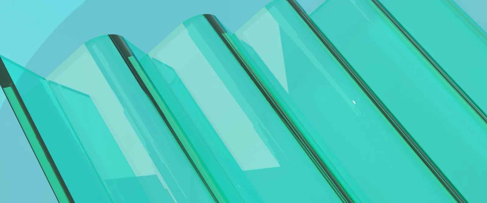
On the web, we approximate this look with CSS backdrop-filter and semi-transparent backgrounds. Modern browser support is now strong enough for production use. You can blur content behind a card, add soft borders and glows, and create that frosted-glass depth.
However, Apple's full effect – dynamic light refraction, elastic wobble, specular highlights that shift as you move the device – is not available as a simple CSS property. Achieving true distortion requires SVG filters or Canvas tricks that are complex, inconsistent across browsers and rarely worth the engineering time for a typical business site.
When Liquid Glass helps and when it hurts
Used sparingly, glass effects can make an interface feel current and premium. They add depth, separate foreground from background and signal that a brand pays attention to detail. For creative, tech or luxury businesses, a well-placed glass panel can elevate a hero section.
The risks are real, though. Translucent backgrounds over busy imagery harm text contrast and legibility. Heavy blur taxes GPU performance, especially on mobile. Constant shimmer and motion can distract users or cause discomfort for those sensitive to visual noise. Usability experts have criticised Apple's own implementation for prioritising spectacle over clarity – a warning worth heeding.
Practical rules
Use glass effects for a few key elements – a hero section, a primary call-to-action – not every card on the page. Keep blur values modest and test on actual mobile devices. Always check contrast and provide a solid, non-transparent fallback for accessibility.
A smarter way to use Liquid Glass
You do not need to copy Apple pixel for pixel to feel modern. Treat Liquid Glass as a subtle accent rather than the whole experience: one hero panel, one pricing highlight, while the rest stays clean and solid. Timeless fundamentals – hierarchy, contrast, clear copy – outlast any material trend.
If you are tempted to experiment, start by checking whether your current site even needs a visual refresh. Rocking Tech's Digital Presence Snapshot offers a quick, low-commitment audit that can flag whether your site feels dated or cluttered. For businesses planning a bigger redesign, the Comprehensive Digital Presence Audit goes deeper, advising whether trends like Liquid Glass actually suit your brand, audience and performance constraints.
Before you commit to shimmering glass panels, get an external pair of eyes on the fundamentals first.
Ready to find out what’s costing you leads?
From £95+VAT · 48 hours – 5 days · Human-led review